Wednesday, March 18, 2015

Hugs and a Bright Tag


On Sunday I was experimenting with my small little gelli plate and doing some gelli printing onto tags.  I used some blue and green acrylic paint and a few stencils with my gelli plate first.  Then, when that was dry, I used my neon yellow Hero Arts Ink dauber to color the rest of the tag.  I also had this new stamp called Hugs that I got from Paperbag Studios.  The bright tag seemed to call for these beautiful sisters hugging each other so lovingly.  Or is it a mother and a daughter?  Either way, as a mother of two teenage daughters, when I saw this stamp I new I must have it.   This was a pretty simple tag to put together and I really like the pop of the hot pink.  The hot pink flowers at the top of the tag were stamped using one of Julie Balzer's new stamps from her Hand Carved Flowers set.  The girls hugging were stamped onto newsprint with Watering Can Archival Ink.  I then used my Inktense pencils to do some coloring.  I cut the corners off (to make it fit better onto the tag) and mounted it on some pink paper before adhering it to the tag.

Here's a close-up of the flowers and leaves at the bottom.

Thanks for stopping by!

Monday, March 16, 2015

Dina Wakley Inspired Art Journaling


In January as I was drooling over Dina Wakley's art, (created with her newly released masks, stamps and stencils) I decided to make a list of all the things she does - techniques and components -  when creating a page or a tag that make me love her work.  I was particularly inspired by her posts and the art included in these posts from January 7th, January 9th and January 13th.  Check them out!  I know that one thing I love about her art is how she puts colors together.  Beautiful!  I don't have her paint but wish I did!  I also love that her style is somewhat messy and thrown together but also intentional and expressive.  So here's my list:

So, as you might have guessed, I set out with this list and began to create my own art journal spread incorporating the things listed.   It was fun to create with a sort of recipe but still with a lot of freedom to choose colors and stamps.  (I didn't have her newly released stamps at this time or I would have used them.)  Check out this post to see how I did incorporate some of her new stamps using much brighter colors.  And this post too!  Here are some more photos of my art journal spread.

 It was really fun to incorporate pieces of paper bag, fabric and some stitching.

It's not the easiest thing in the world though to get your art journal in position to stitch with a sewing machine.

One thing I didn't write on my list but that I see Dina Wakley do, is to leave some white  space showing.  I did leave some white on these pages.
Thanks for reading!  Have a great week!

Friday, March 13, 2015

Green Leaves and Golden Yellow

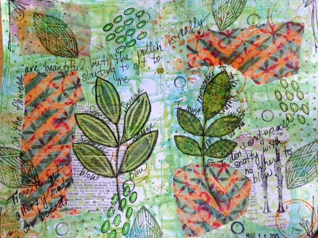
This page started with some ink or paint from a stencil I'd cleaned off.  Then I did some gelli printing directly into my art journal over what was already there.  This provided a nice starting background.  First I collaged some pieces of gelli printed papers and some torn dictionary pieces down over the paint.  Then I tried to mellow the sharp contrast of the golden yellow paper pieces by stenciling some light green paint over them.  I recently purchased some of Julie Balzer's new stamps which I used on this spread.  I also used a new (to me) Carabelle Studio set of stamps designed by Birgit Koopsen called Leafs.
I don't usually do much journaling in my art journal because I keep a separate journal that is specifically for writing in.  Some would call it a diary but I call it my journal.  But I must say that I really like the look of writing or journaling on the pages of an art journal.   So even though I already wrote in my journal this morning I decided to journal a little about my darn allergies on this spread.  As Spring is almost here the pollen has really been making me sneeze which then triggers my nose to run.  And it's miserable to be caught outside with no kleenex when the sneezing gets the best of me.  

Here are a few close ups of this spread.


I am a sucker for leaves and flowers!  I especially love the stamp or stencil with multiple leaves on a stem.    Thanks for stopping by!  Have a great weekend!

Monday, March 9, 2015

An Art Journal Page: Portholes Into Blue Skies and Butterflies

For this layout I was eager to try my new Hazel and Ruby stencil-masks in the confetti pattern.  I started by laying down some aqua paint and then adding some Tim Holtz tissue paper.  Then I stenciled some green, yellow and blue paint through my Nathalie Kalbach Art Deco Wallpaper stencil.  This is where I laid down my Hazel and Ruby masks.  

 After the masks were down (they are sticky and stay in place quite well) I continued to lay down spray inks and do some stenciling through a chevron stencil with green paint. I also used white paint and stenciled some white dots.  The last thing I did before removing the confetti masks was to trace around each circle with my black Stabilo-All pencil.  As you can see I had some fun with a white pen and a neon pink Liquitex paint pen.  I also laid down a few pieces of tissue (washi like) tape.

When I look at this I feel as if I'm in the dark green sea looking up through portholes at blue skies and butterflies.

Thanks for stopping by!

Saturday, March 7, 2015

Aged Silver Embossing Enamel Over Texture Paste . . . Very Cool!

Tim Holtz posted a great tutorial for his 12 Tags of 2015 for the month of March.  Here's a link to this fabulous tutorial.  I had fun using my distress paints and tissue tape in the background and creating my own version of a Tim Holtz style tag.  I used Stampendous Aged Silver Embossing Enamel over texture paste with Tim Holtz's  Flourish stencil.  I love the look and the texture of this.  I added some ribbon, flowers and other embellishments to complete this tag.  


I just discovered a great blog called A Vintage Journey.  A Vintage Journey is a challenge blog  for those who love to make vintage, shabby, mixed media, journaling projects AND who are strongly influenced by the work of Tim Holtz.  Check out A Vintage Journey blog here.  The title of this month's challenge is "Anything Tim".  Here are a few close-ups of my Tim Holtz influenced tag.


Thanks for stopping by!

Wednesday, March 4, 2015

Paper Artsy Birdhouses and Flowers

I finally found some time to play with some Paper Artsy JOFY stamp sets (collections 15, 22, 24 and 26) that I purchased a while back.  I love these birdhouses, the birds and the flowers.  I stamped the images with my black Archival Ink Pad and colored them in with Inktense pencils and a water brush.  The background was created a few weeks ago in my attempt to use up some left over paint.  I simply grabbed the stencils I had closest to me.  The reddish pink flowers were stenciled with a Tim Holtz layering stencil called Blossom.  The green leaves were stenciled with a Donna Downey stencil called Leaf-Stem Trio.
I was liking this layout . . . but what really made me love it was the addition of the Liquid Pearls.  Those little yellow dots on the flowers really bring some dimension and excitement that add to the whole thing.  I ought to use my Liquid Pearls and Stickles more often!
 The lime green birdhouse kind of feels like it needs a bird.  I might have to add one.  But even without the birds the flowers and the birdhouses have me smiling.
Thanks for stopping by!

Monday, March 2, 2015

Art Journal Fun with Dina Wakley's Woodcut Stamps and a Scribbly Bird

The joy and fun I've experienced working in my art journals the past three days is immense.  I'm having a blast!  The weekend was beautiful and I did get outside, but some days I think the joy I experience from creating is even more than that which I experience on a trail run.  Maybe I should just say they are two completely different joyful and satisfying experiences. (One burns a few more calories than the other!)  Here is a spread I worked on on Saturday.  I love how the magenta color looks over the blues and greens.

The hearts and the leaves on a branch are from Dina Wakley's Woodcuts set of stamps.  The bird is from her Scribbly Birds set.  I incorporated some stitching and some fabric into these pages.  I also used some new washi tapes.  For the background I stuck down some Italian music paper before scraping on some blue, green and teal paint.


Thanks for looking!